
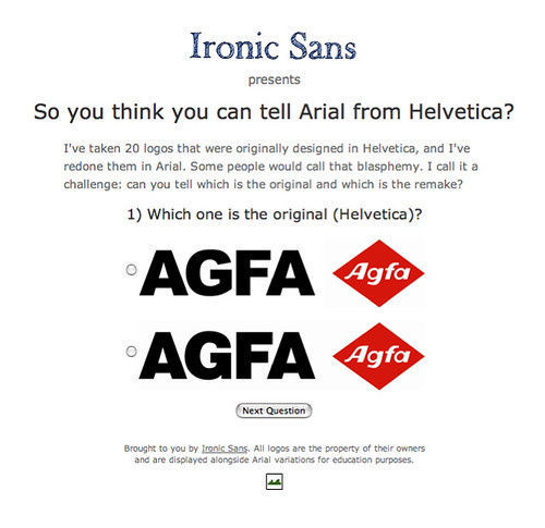
Ironic Sans presents a fun little quiz for the typographically inclined - So you think you can tell Arial from Helvetica? Try it! Through 20 logos originally designed with Helvetica, redone in Arial... blasphemy? Perhaps... but, a fun challenge anyhow.
Feeling up to the challenge? Go and check it out for yourself at http://www.ironicsans.com/helvarialquiz/ - enjoy!
3 comments:
I am often faced with Helvetica, which I don't care for, because MS Word seems to like it and Times New Roman (another ubiquitous clunker). What I remember about it is the thickness, the heaviness of it, so I am guessing that the lower of the two typefaces in the illustration is Helvetica. Arial seems light, somehow--still essentially uninteresting and utilitarian, but lighter.
Probably my age: I like the older serif-haunted typefaces like Goudy and Garamond.
You're correct Pete. The lower of the two typefaces in the illustration is Helvetica.
The most obvious differences between the two typefaces can be seen in the 'kerning pairs' and in the 'counters'/'terminals' of the letter forms themselves.
Thanks for the comment! Cheers!
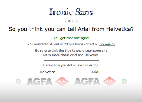
I got 15 of them :)
On of the easiest way to tell is the curves of the letters, and the lower case t, There was a slant on the arial one and not on the other :D
Post a Comment